
A Data-Driven Rethink
Context
AMARO is a fashion and technology company based in São Paulo, Brazil, known for its innovative approach to blending e-commerce with fast fashion trend and great experience through physical stores and e-commerce. After years of serving users, the page containing essential product information is no longer performing well, having not been updated for over a decade. How can we improve the performance of this critical ecommerce page?
Behind the Redesign
Approach & Methods
I applied Design Thinking to guide the process, combined with Accessibility Audits, Heuristic Evaluations, Competitive Benchmarking, Behavioral and Web Analytics. I also worked on improving the Design System and running A/B tests to validate changes.
Tools & team
I used Figma and FigJam for layouts, benchmarking, and component design.
Confluence and Jira supported documentation, handoffs, and prioritization.
The design team included myself as Lead Product Designer and one Senior Product Designer.
Results & Time
Timeline: 2 weeks for research and initial prototyping, followed by 2 to 4 weeks of experimentation and handoff.
Outcomes: 64 redesigned screens and 23 new components addressing 30% of the page’s accessibility issues, leading to a 5% increase in conversion rate and a 20% increase in gross revenue.
Leading the end-to-end design experiences
My role
Lead product designer
As the Lead Product Designer, my main goal was to connect the page’s potential with business and tech priorities for the quarter. I led the product designer, guiding them through each step, and advised developers and stakeholders on design choices.
Prototyping & Components
I designed wireframes, prototypes, coordinated design critiques and created components that were easy to code, along with design specs.
Project management
In project management, I collaborated with fellow leaders to find improved solutions, made crucial decisions during implementation challenges, and ensured alignment of strategy and goals with stakeholders and directors.
Research & Experiments
I collaborated closely with the product designer to uncover valuable insights and translate conceptual ideas into solutions that meet customer needs and address their pain points through experiments, users feedbacks and competitive analysis.
Why a Redesign Was Needed
The Problem
The Product Detail Page — one of AMARO’s most critical conversion points — hadn’t been updated in nearly a decade, resulting in outdated UX, accessibility issues, and poor SEO performance.


Diggin a little deeper
Impacts on the users
Before jumping into design, we took a step back to understand how users were interacting with the page. By analyzing data and behaviors across thousands of sessions, we uncovered a series of usability and performance gaps listed below by level of impact.

- Non-responsive layouts across devices created inconsistent user flows, and poor readability;
- Accessibility was poor;
- Users struggled to complete purchases efficiently, especially on mobile;
- The lack of scalability (components and space for more content and scenarios);
- Legacy stack – difficult to make updates, without breaking or having extra-work;
Impacts on the business
On stakeholders interviews, data analysis, and discussions with engineers and PMs we found some more relevant impacts:

Outdated Tech Stack
Outdated code and structure were harming SEO performance, leading to declining organic traffic month over month.

UI Limits for Product Variants
Vendors required more flexibility to showcase product variations and details, demanding UI updates to support these needs.

Performance & Accessibility Gaps
Page speed, inconsistent HTML, and accessibility flaws were severely affecting performance and user experience.

Rising Acquisition Costs
High bounce rates led to wasted traffic investments and lower return on ad spend, driving up customer acquisition costs.

A Structured Approach
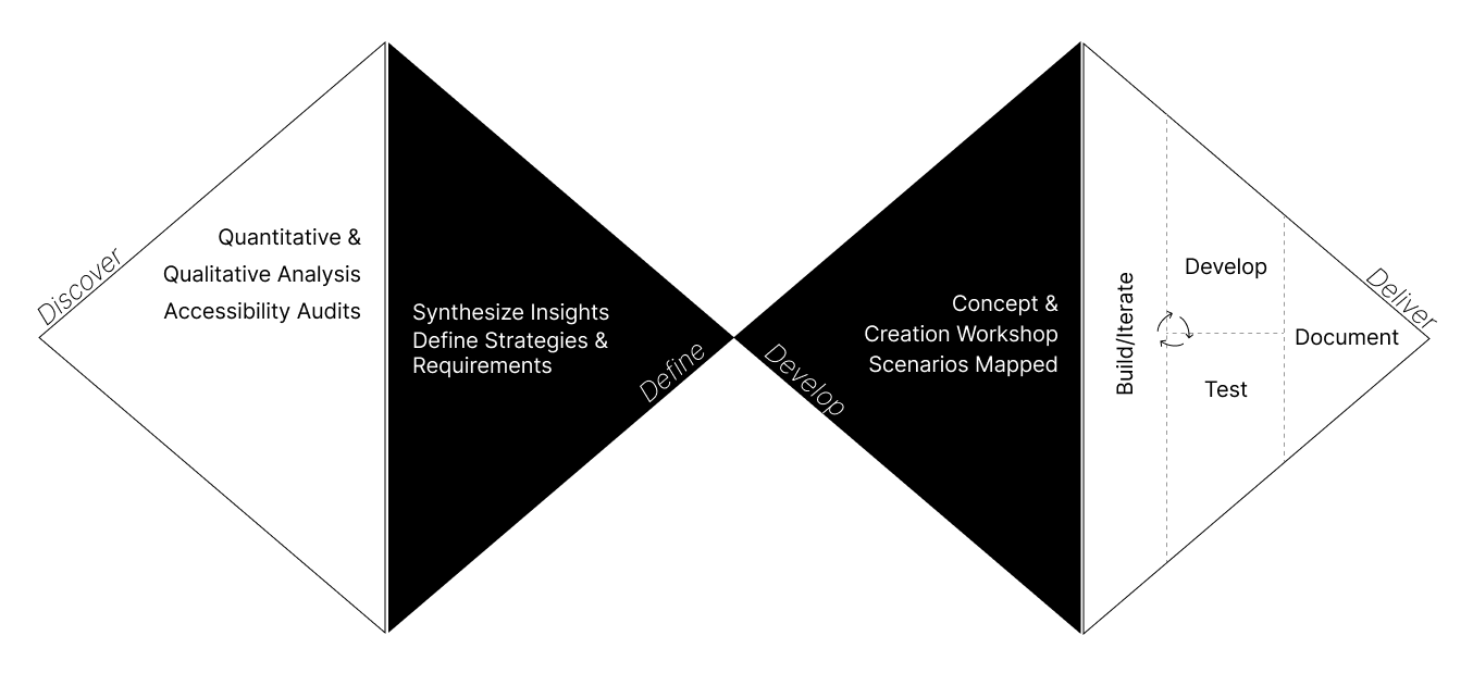
The Process: Thinking in Diamonds
We chose to follow the Design Thinking methodology, structured through the Double Diamond framework, because it allowed us to deeply understand user pain points before jumping into solutions. This approach helped us navigate complexity, align cross-functional teams, and ensure that every design decision was grounded in real user needs and business goals.
Let’s look at some of the insights
Discover Insights
To inform the redesign, we conducted a mix of stakeholder interviews, usability and accessibility audits, user feedback analysis, behavioral tracking, and web analytics. This helped us uncover key friction points and opportunities, summarized in the insights below.

Insight #1
An hybrid page it’s more reliable
Over time, we discovered that a versatile page showcasing any product from any category with consistent features boosted scalability and user trust. Maintaining uniformity across pages and elements was pivotal for a reliable and consistent design.
Insight #2
Responsiveness its a must
Users faced reachability issues on mobile, contributing to a 25% bounce rate caused by misclicks. Layout distortion across devices, including desktops, caused a 30% decrease in scrolling compared to other pages.


Insight #3
Delivering information only when needed.
Customers were inundated with diverse product information, making anticipating worst-case scenarios challenging (given the constantly evolving marketplace). Therefore, we should develop scalable ways of personalize the page during seasonal campains or sales.
Not Just a Pretty Page
Key Redesign Goals
We translated research outcomes into clear design principles for the new PDP.
#1
Hybrid Page
Design a flexible page structure optimized for fashion, but adaptable to other product categories as the business grows.
#2
Full Responsiviness
Ensure the layout adapts seamlessly across all screen sizes and devices, preserving structure and usability everywhere.
#3
Scalable Components
Build modular components that support all product variants and use cases.
#4
Acessibility
Address critical accessibility issues that were lowering performance scores and negatively impacting SEO rankings.
Turning Insights in Ideas
Sketches & Wireframing
After identifying goals and insights, we collaborated with the design team for a Crazy 8 dynamics session to expand our solution vision. We focused on designing what was the hyphotesys that we wanted to test, also focusing on a smart Information Archteture.
Following the initial sketches, I transferred all screens into Figma to craft detailed wireframes. This allowed me to explore various scenarios even some major interaction for desktop devices and tablets. In this phase, close collaboration with the business area was pivotal to tailor specific views that aligned with the required information.


Design & prototype
Testing Hypotheses and Refining Interactions through A/B Tests
In the initial layout, we formulated several hypotheses, prompting the need for additional evidence to validate our assumptions. Hence, we conducted A/B tests, leading to insightful results leading to major changes on the design:
The purhcase details Hierachy
Clear visual hierarchy is crucial when managing large amounts of information. In A/B tests, we observed a notable increase in engagement (e.g., clicks on “Add to Favorites,” reviews) by providing greater prominence and space to buttons and titles.


reducing noise
We found that adding familiar information only increased interface complexity unnecessarily. Our objective in testing was to remove unnecessary details while keeping interactions clear for users.
Modal Page vs. Static
In comparing a modal page (the old page) to a static one for general navigation, the static page emerged as the superior choice. The modal page’s loading issues hindered user engagement. Transitioning to a static page showed significant improvements in conversion rates, access, and overall interactions. This emphasized the importance of a stable and responsive interface for optimal user engagement.

Creating scalable components
Component Design
Before creating extensive pages, we started with atomic elements, pinpointing what didn’t fit our design and fine-tuning for scalability during the design process.


Hand Off – Documentation
Recognizing that clear communication with developers was crucial, we established a collaborative space where developers and designers could work in parallel. This innovative approach enabled us to deliver the redesigned page swiftly without compromising quality.

New Perspective: This streamlined collaboration marked a significant advancement in terms of speed and integration among team members. The novel development approach redefined the process of component handoffs, facilitating parallel work within the same framework.
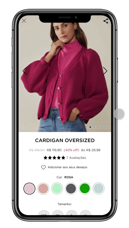
The Final Screens
Mobile

Desktop


Results
-40%
of Dead Clicks in the page
Also a bounce rate reduced by 5% in mobile devices.
4,8%
Uplift in Conversion rate
Calculated through the A/B Tests
30%
Acessibility Issues solved
Scanned throught axe DevTools
64
screens
Were made in order to review from to the most simple scenario, to the most complex.
23
New components
recreated to serve a Design system and the Product Detail Pages.
Move the arrows to the left or to the righ to check the before and after respectively.


AN Impactful Outcome, with Impeccable Documentation.
Final thoughts
Leading the team, I’m proud of our adaptability. As an individual contributor, navigating negotiation challenges, particularly on the critical e-commerce platform page, was key. We swiftly overcame barriers across business areas.
A crucial lesson learned: UX processes aren’t always linear. Flexibility is vital, balancing speed with ensuring proper checks for optimal outcomes.