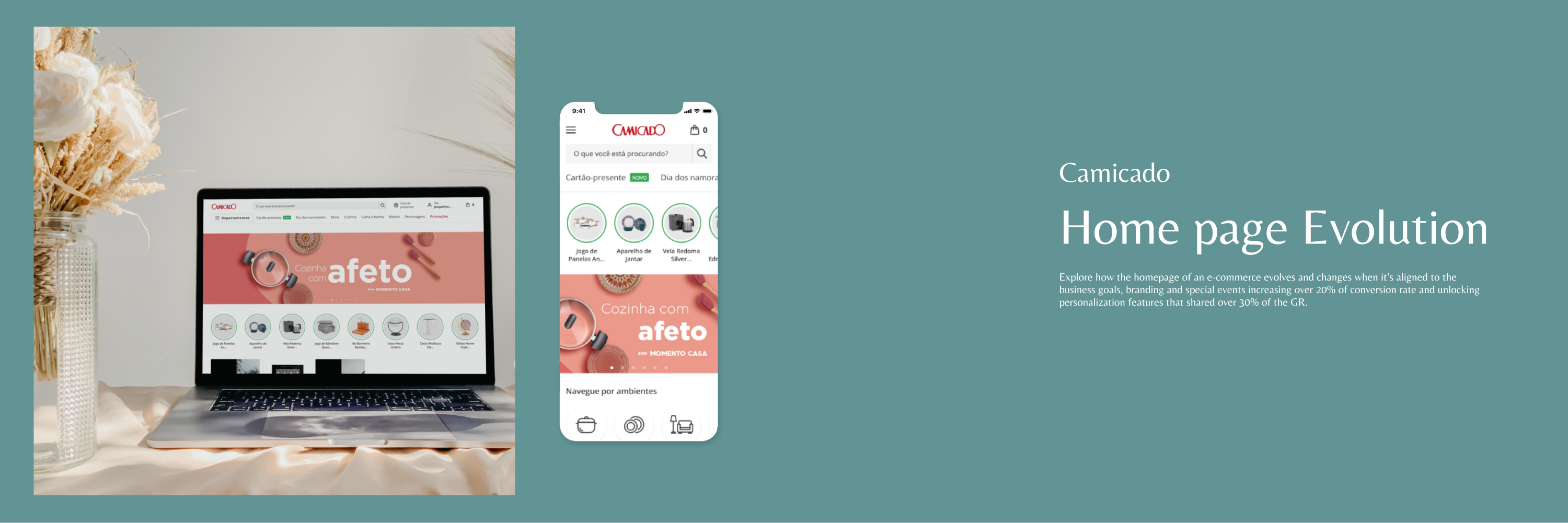
A Data-Driven Rethink
Context
Camicado, a leading home & decor retail brand in Brazil, operates across physical and digital channels. However, the company faced a critical challenge: its homepage attracted only 15% of total user traffic—well below the market average of 30%. This indicated that the page was underperforming in its role as a gateway to discovery and conversion.
The COVID-19 pandemic amplified the urgency to address this issue. With physical stores closed and revenue targets shifting to e-commerce, a strategic redesign of the homepage became essential to drive traffic, engagement, and online sales.
Behind the Redesign
Approach & Methods
We followed a Design Thinking approach, focusing on both business needs and user behavior. The process included stakeholder interviews, behavioral and web analytics, usability evaluations, competitive benchmarking, and rapid prototyping. Our goal was to reposition the homepage as a strategic content and navigation hub that could adapt to business demands and user expectations.
Tools & team
Figma and FigJam were used for ideation, prototyping, and layout exploration.
Documentation and workflow were managed through Confluence and Jira.
The core design team included myself as Lead Product Designer, supported by a mid-level UX designer and cross-functional collaboration with Marketing and E-commerce stakeholders.
Results & Time
Timeline: 2 weeks for research and concept validation, followed by 3 weeks of iteration and alignment across teams.
Outcomes: A redesigned homepage framework that increased its share of user traffic from 15% to 28%, with improved engagement metrics and alignment with digital marketing campaigns.
The Problem
The imperative was clear: to transform the homepage into a dynamic and compelling hub that not only resonated with users but also served as the primary revenue driver in a rapidly shifting retail landscape. In a nutshell, the problem boiled down to a UX dilemma: how to optimize the homepage to enhance user engagement and drive conversions amidst unprecedented market conditions.
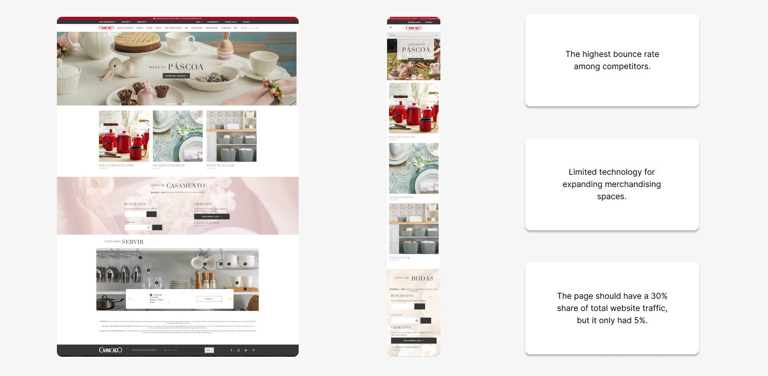
Research & Strategy
As the head of the UX team, I initiated a comprehensive overhaul of the homepage to address the multifaceted challenges facing Camicado. While gathering data and conducting analyses to identify potential page issues, I also solicited internal feedback from the marketing and merchandising teams responsible for campaign promotions. Recognizing the urgency of the situation, we formulated a plan encompassing three key strategies:
As the timing is important we decided to apply one strategy at time.
#1 Strategy
2020 March
- Increase content space on the homepage to provide flexibility in showcasing campaigns
To begin with, we conducted a benchmarking analysis, evaluating how the homepages of our direct competitors were structured and what set them apart. Based on this assessment, we gathered information and brought it to a conception meeting with the marketing and merchandising team.
Benchmarking

During this conception meeting, we listed and discussed content formats, both in terms of potential production by our teams and as solutions for the current customer landscape. From there, we were able to generate a vision for the formats and quantity of content we wanted to add. After facilitating this meeting, we translated the solution into a wireframe. Given the time constraints, we then began envisioning the layout.
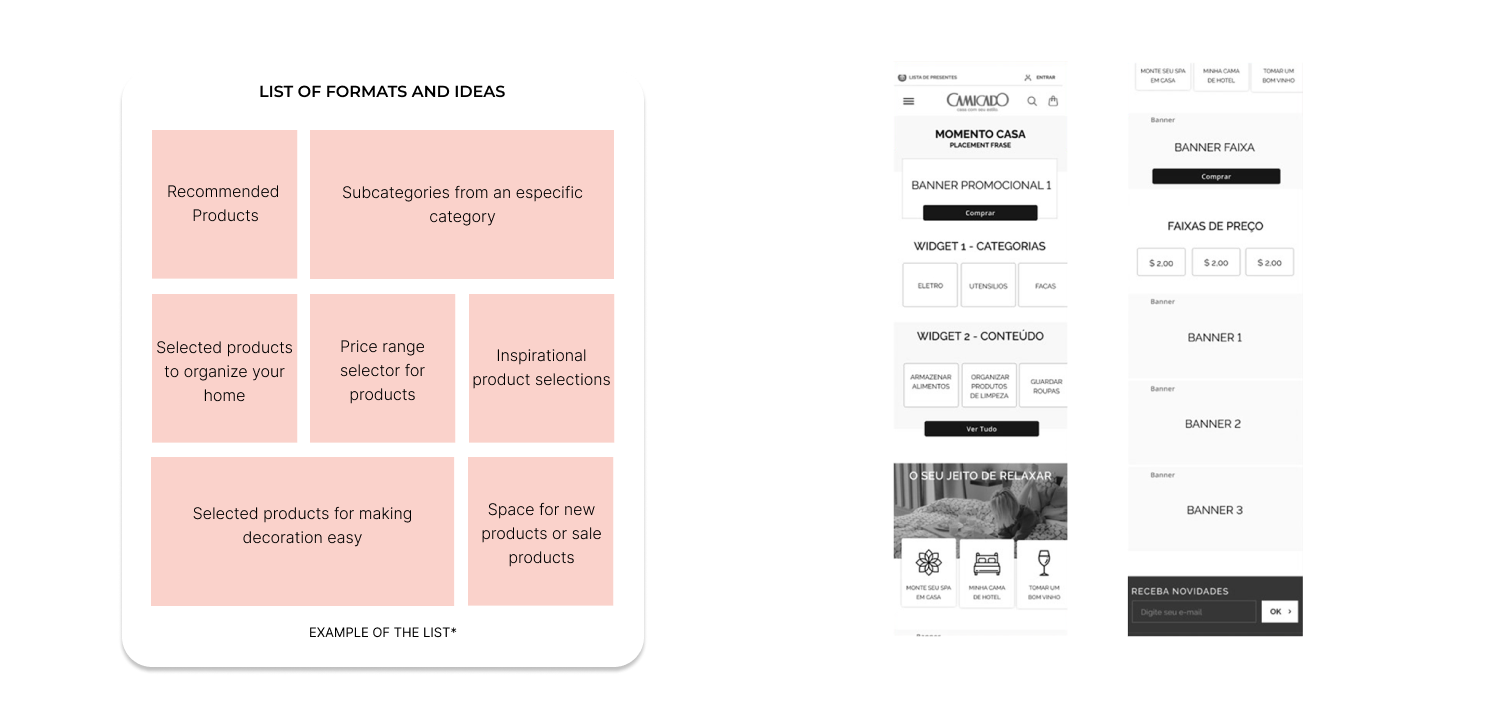
#2 strategy
2020 june
- Streamline and automate homepage updates for the marketing team to ensure timely and frequent content refreshes.
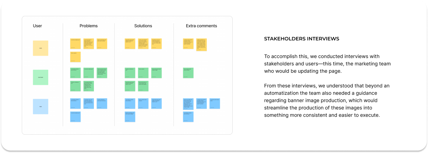
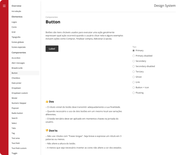
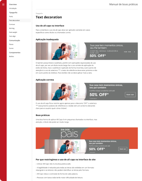
Starting from when we learned from Strategy 1 and the solution developed, during Strategy 2, the research and understanding process became more internal than external. We needed to simplify the page update process for the creative marketing and design teams. To achieve this, we required more standardized formats for banners and marketing spaces, and automating solutions was also of great importance.
Simultaneously with the execution of Strategy 1, we had a design system being implemented, and the page visuals also had to align with the design system.
Simultaneously with the execution of Strategy 1, we had a design system being implemented, and the page visuals also had to align with the design system.
#3 strategy
2020 october
- Enable personalized homepage customizations for major campaigns, leveraging unique features to engage users dynamically
As the biggest e-commerce sale of the year approached, there was a pressing need to expand merchandising spaces to showcase the campaigns effectively. Concurrently, we sought to understand customer expectations for Black Friday and other promotions. To achieve this, we conducted online surveys to gather user feedback and insights.
Following the survey responses, we gained valuable recommendations for business areas and insights into user needs during Black Friday. Additionally, we evaluated the current performance of each campaign display format.
In parallel, we organized a workshop involving developers and stakeholders to collaboratively envision the full potential of personalization for the upcoming major campaign.

Solution & Results
#1 Strategy
- Increase content space on the homepage to provide flexibility in showcasing campaigns
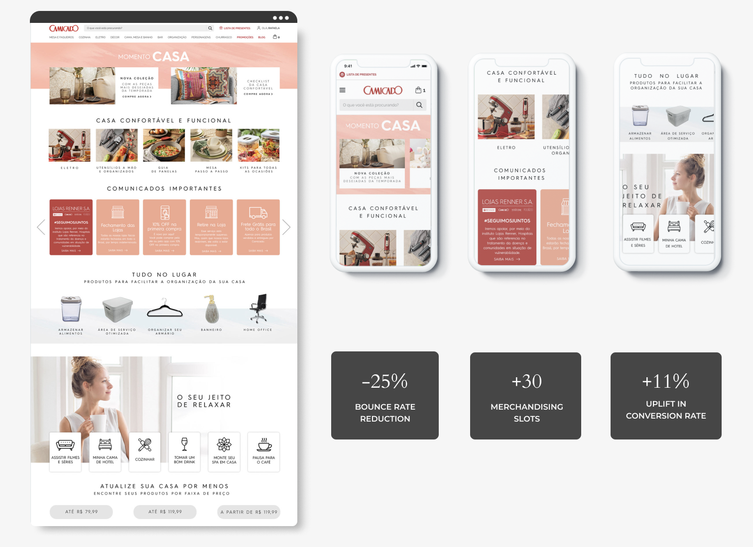
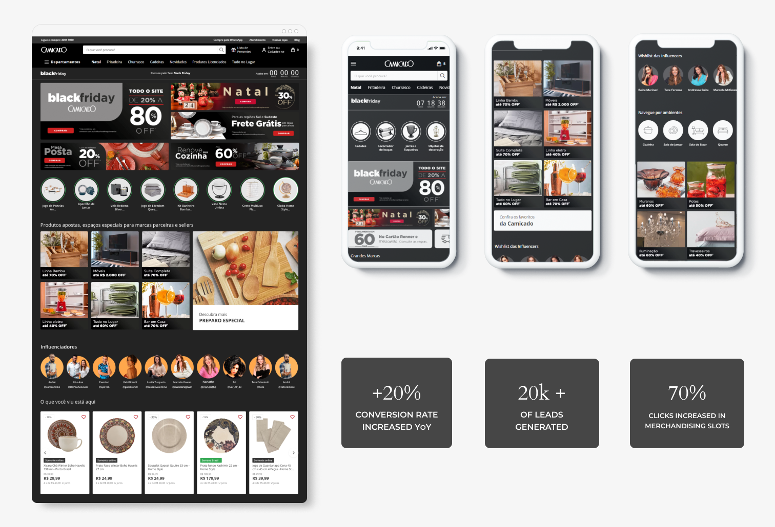
As we developed this solution, our main hypothesis was: “If we increase the number of placements for merchandising campaigns, will we engage users more?” To test this hypothesis, we conducted an A/B test to understand if each newly created section would yield the desired results.
#2 strategy
- Streamline and automate homepage updates for the marketing team to ensure timely and frequent content refreshes.
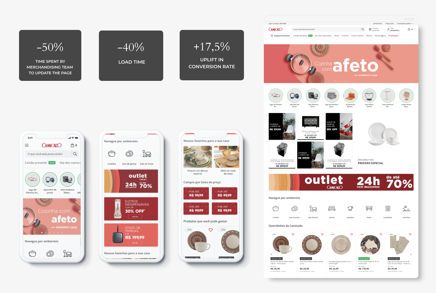
While developing this solution, we understood that some merchandising slots needed to be revised to bring greater standardization and consistency to the page. We also tested the idea of featuring recommended products, which also brought gains to this version. The main focus was on reducing the time spent by the design team to update the page.
#3 strategy
- Enable personalized homepage customizations for major campaigns, leveraging unique features to engage users dynamically
I wanted the website to present different facets to frequent users. Introducing the option to change the homepage’s appearance for major campaigns not only increased conversions but also fostered a sense of familiarity with the brand among users. They could observe that the brand consistently offered new products and campaigns.
Reflection and Future prospect
The journey from conceptualization to implementation underscored the importance of agility and collaboration in navigating unprecedented challenges. Leveraging insights from user feedback and cross-functional collaboration, the final iteration of the homepage represents a culmination of iterative refinement and strategic foresight. Looking ahead, ongoing optimization efforts will continue to elevate the user experience and drive sustained business growth, reaffirming Camicado’s position as an industry leader in the digital retail landscape.

Designed by me 💜